
This Isn’t Just a Rebrand
Rebrands can feel intimidating.
They come with new colours, new logos, new language — and sometimes a quiet (or very loud) fear that something familiar is being lost.
That’s not what this is.
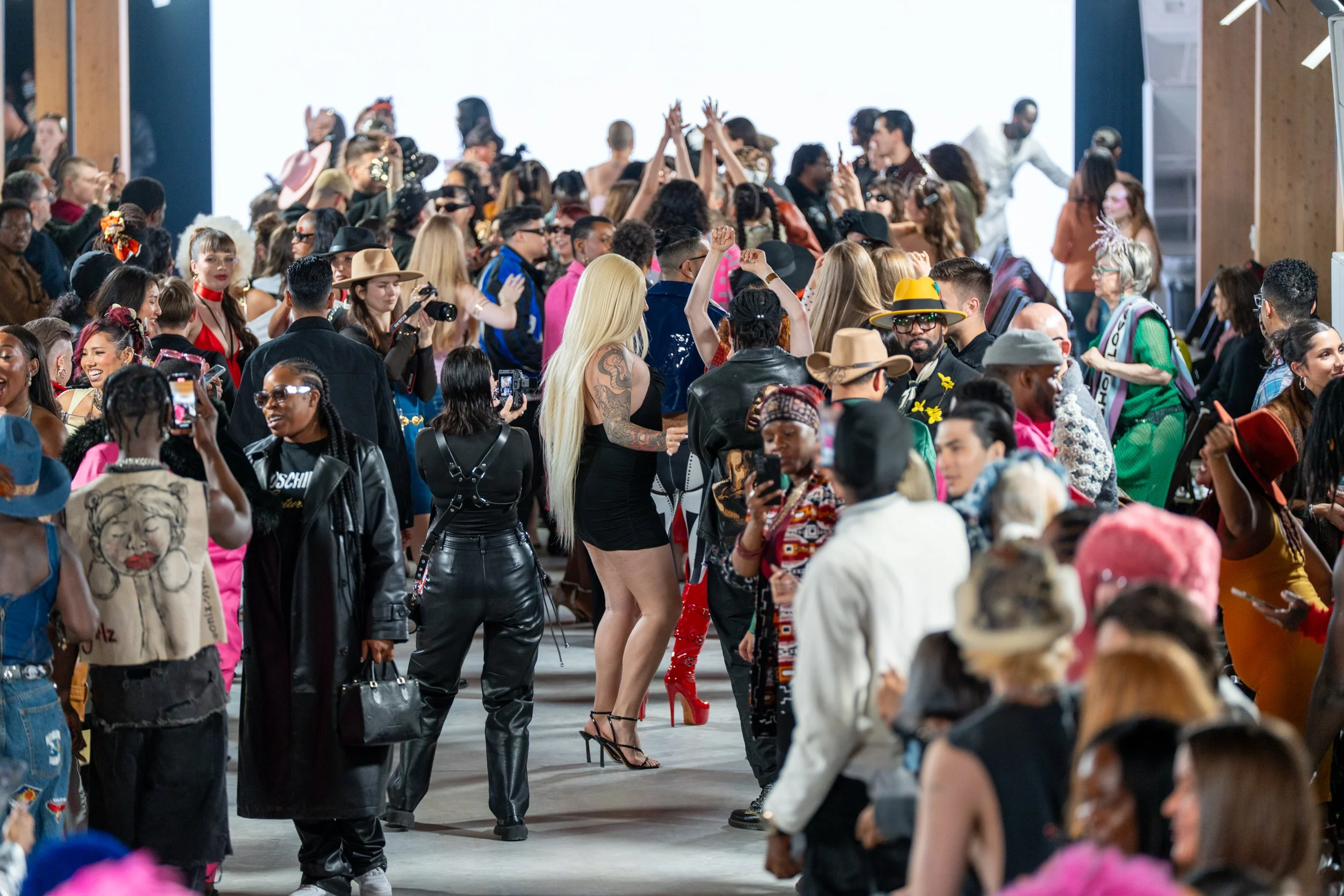
For more than 20 years, Fashion Art Toronto has created space for designers who exist outside traditional fashion systems. We’ve built platforms for experimentation at the intersection of art and design. We’ve championed voices that might otherwise go unheard.
What began as an alternative fashion week grew into Toronto’s largest and longest-running fashion and art week.
That growth required structure and we have built something that could hold weight.
But growth doesn’t stop once you’ve built the frame. It pushes against it.
Breaking the Frame
If you look at the new logo, it’s hard not to notice the difference.
One border is gone.
For years, two vertical bars framed the name — strong, contained, almost like a runway. They symbolized stability and the foundation we built.
Now the right border has been removed. Intentionally.
It’s a signal: we are open to expand, to collaborate, to move forward. We are not contained by what we’ve already achieved.
Deliberately, one line remains.
It represents legacy. It represents the structure that allowed us to get here. Breaking boundaries is not equal to abandoning foundation.
Taking Up Space
This rebrand is also about presence.
We are a Toronto-based nonprofit arts platform. We are a fashion and art event with over two decades of history. And we are part of a broader global cultural dialogue about how cities shape contemporary art and fashion.
Expanding does not mean softening our edge or forgetting where we came from. It means expressing who we are with greater clarity — through our images, our programming, our typography, and even our red.
Our original red — bright, urgent and disruptive — reflected an earlier stage of growth. It demanded attention.
Today, our red carries depth.
Vessna Red — named in honour of artist Vessna Perunovich — carries lineage within it. It is warmer, more deliberate. It moves through the system with intention, reminding us that we continue to operate at the intersection of art and fashion.
Yes, we’ve changed how we look, but the work remains.
The frame is open. The foundation holds and the future isn’t something we’re waiting for.
It’s something we’re building.
Our Logos:
From our beginnings through the partnership with 1664, this was the mark Canada came to recognize.
2005 - 2026
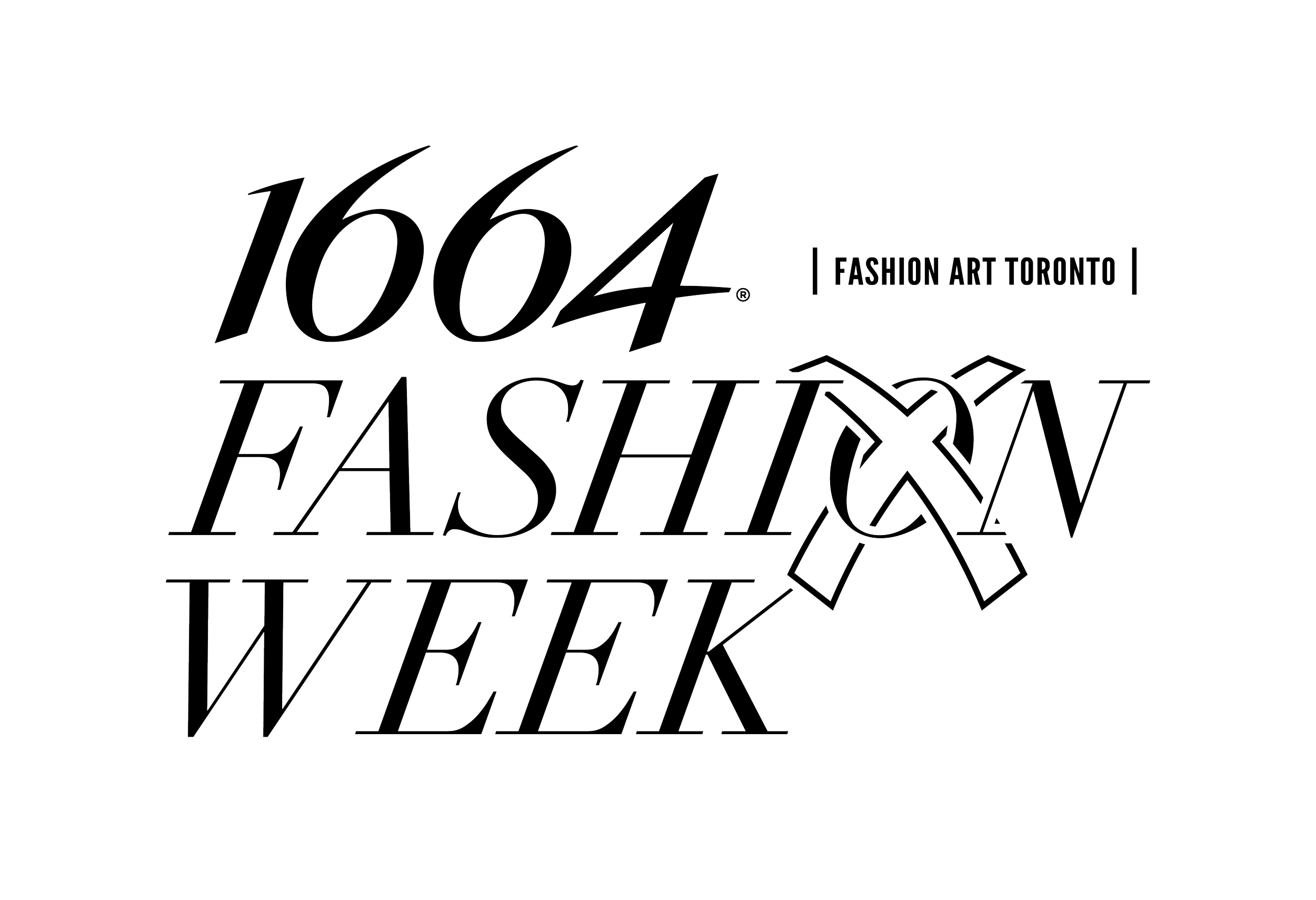
The official partnership with 1664 marked the beginning of a new logo, shaped by a mutual passion for fashion, art, and design.
2023 - 2026
Full 2026 Logo